We’d love to hear from you — whether you have a project in mind, or just want to say hi.
hi@opticalpopdesigns.com

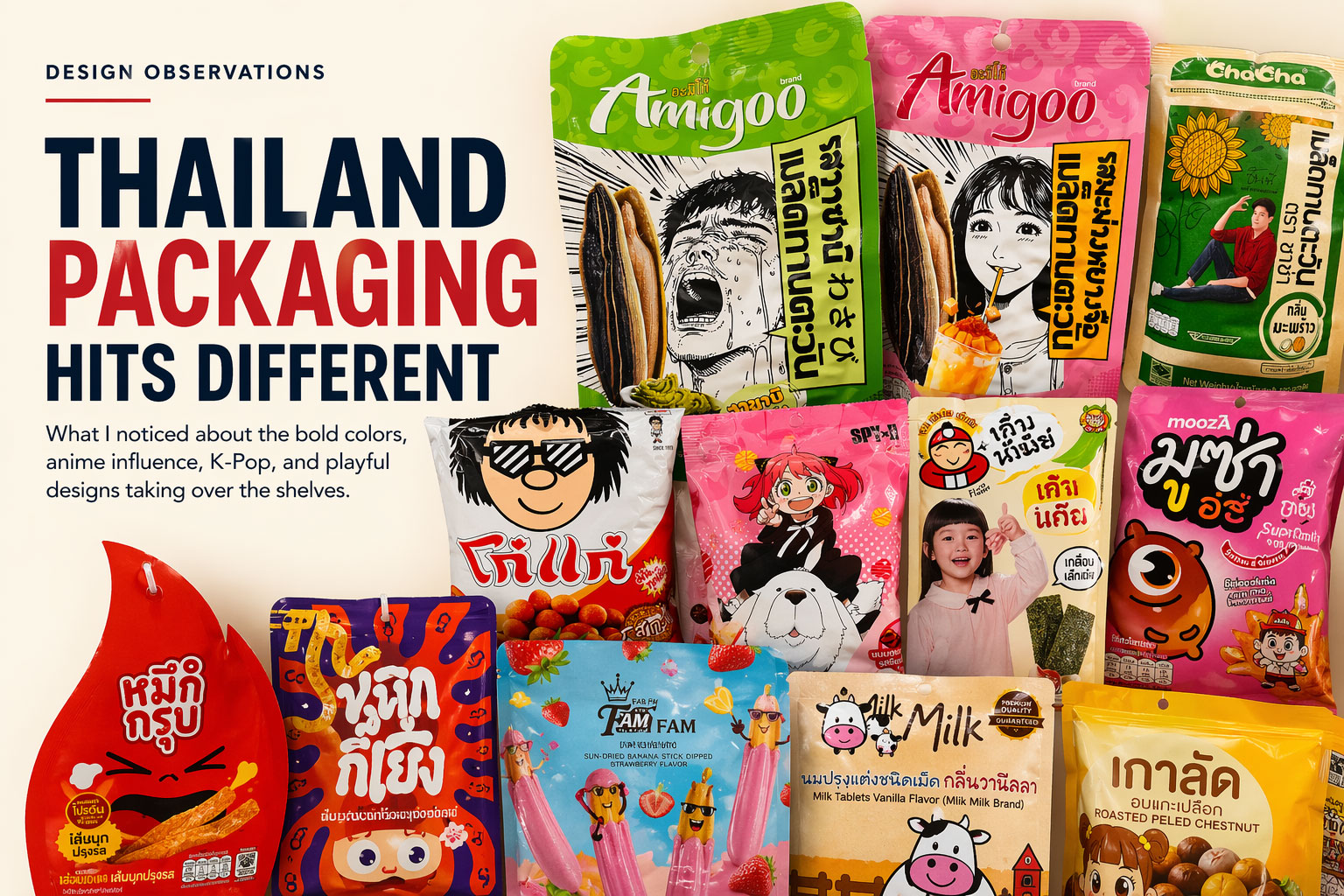
I spent time walking through convenience stores and markets in Thailand, and honestly… it feels like stepping into a completely different design philosophy.
Not better. Not worse. Just playing a totally different game.
Here’s what stood out.
In the U.S., we’re obsessed with clarity:
Thailand flips that.
A lot of these packs feel like mini posters, comics, or characters you’d see in a show. They’re loud, expressive, and emotional.
Some of them barely explain the product at first glance. And they don’t care.
Because the goal isn’t just to inform.
It’s to make you feel something instantly.
Curiosity beats clarity.
This was probably the biggest pattern.
And here’s the key insight…
This isn’t just targeting kids.
Adults are buying this.
There’s a cultural comfort with playful design that we’ve kind of lost in Western CPG, where everything trends toward “clean,” “minimal,” and “premium.”
Thailand leans into:
And it works.
You can feel the influence immediately.
It’s not just endorsement. It’s aesthetic borrowing.
The packaging feels like it belongs in the same world as:
What this does:
It turns snacks into identity products, not just food.
Nothing is shy.
And it’s not random.
Color is used to:
In a crowded environment, subtlety loses.
Thailand chooses visibility every time.
From a Western lens, some of this can feel… childish.
But that’s the wrong read.
It’s actually:
There’s no fear of being taken less seriously.
And that’s something worth paying attention to.
Because a lot of U.S. brands are over-correcting toward:
And in doing that, they lose personality.
Let’s be honest.
If you put these next to a typical U.S. “clean label” brand…
The Thai packaging wins the first 3 seconds. Every time.
And in retail, that’s the whole game.
This isn’t about copying Thailand.
It’s about understanding what they’re doing right:
1. Emotion > Information (at first glance)
You can explain later. First, make them feel something.
2. Personality scales
Brands that feel alive stand out.
3. Playfulness isn’t weakness
It’s a competitive advantage when everyone else is serious.
4. Culture drives design
K-pop influence isn’t random. It’s intentional and relevant.
Thailand packaging reminds you of something simple:
People don’t just buy products.
They buy what catches their eye, makes them smile, or feels different.
And right now, a lot of Western CPG is playing it safe.
Thailand isn’t.
And that’s exactly why it stands out.