We’d love to hear from you — whether you have a project in mind, or just want to say hi.
hi@opticalpopdesigns.com
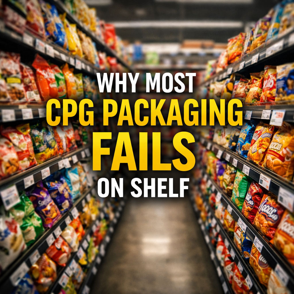
Walk down any grocery aisle and take a step back.
Not as a designer.
Not as a brand owner.
Just as a shopper.
What you’ll notice pretty quickly is this:
Most products blur together.
Same colors.
Same layouts.
Same claims.
And when everything starts to look the same, people don’t stop. They scan. And then they move on.
Shoppers don’t study packaging.
They don’t read every callout or compare every ingredient list. They’re moving fast, often on autopilot, making decisions in seconds.
Your product has a very small window to do one thing:
Get noticed.
If it doesn’t, nothing else matters.
Not your ingredients.
Not your story.
Not how good the product actually is.
1. Trying to Say Too Much
Founders want to communicate everything:
• clean ingredients
• high protein
• gluten free
• non-GMO
• functional benefits
So it all ends up on the front.
The problem is, when everything is important, nothing stands out.
Strong packaging is about prioritization, not accumulation.
2. Playing It Safe
A lot of brands design based on what already exists in the category.
“We want to look premium.”
“We want to look like what’s working.”
So they borrow the same colors, the same fonts, the same structure.
The result is packaging that fits in perfectly.
Which is exactly the problem.
3. No Clear Focal Point
Great packaging has a moment. Something your eye lands on instantly.
A logo.
A bold color block.
A graphic element.
Most packaging doesn’t have that. Your eye doesn’t know where to go, so it keeps moving.
4. Designed for Screens, Not Shelves
A lot of packaging looks great on a mockup or a website.
But the shelf is a completely different environment.
Distance matters.
Lighting matters.
What’s around you matters.
If your design doesn’t hold up from a few feet away, it’s not doing its job.
Packaging that wins on shelf is built around a few simple principles:
Clarity over clutter
Make one thing obvious immediately.
Contrast over conformity
Stand out from what’s around you, not blend into it.
Hierarchy over noise
Guide the eye. Don’t overwhelm it.
Confidence over explanation
You don’t need to say everything to say enough.
Stop thinking of packaging as a place to explain your product.
Start thinking of it as a tool to get chosen.
That’s the real job.
Once someone picks it up, then you can tell your story.
If your product isn’t getting noticed, it’s not because people don’t care.
It’s because they never saw it in the first place.
And in a crowded category, visibility isn’t a nice-to-have.
It’s everything.
At Optical Pop Designs, this is exactly what we focus on. Creating packaging that stands out in real-world conditions and earns that moment of attention.